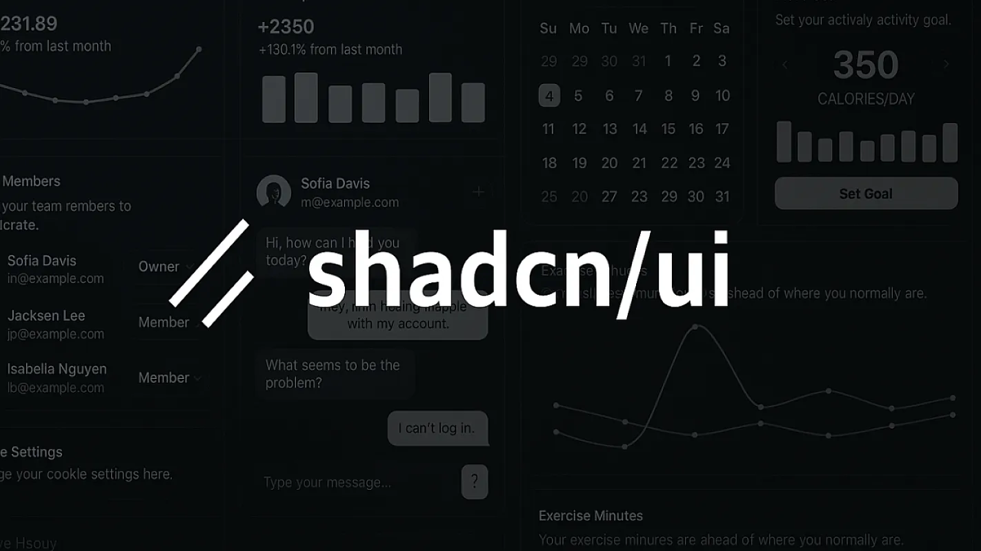
51 shadcn/ui Components in a Real Production Admin: What We Built
What 50 shadcn/ui components and 223 admin pages actually look like in production
 Hamed Pakdaman
Most "built with shadcn/ui" projects use four components: Button, Input, Card, and Dialog. Maybe Table if they're feeling ambitious. The rest of the admin gets handled by a mix of headless libraries, custom CSS, and the occasional Tailwind UI snippet that doesn't quite match.
Unfold CMS uses 51 shadcn/ui components across 205 admin pages. Not as a marketing claim — as the actual count of files in resources/js/components/ui/ and resources/js/pages/admin/. This post walks through which components we actually shipped, where they're used, and what we learned building a real CMS on top of the entire shadcn/ui surface area instead of just the famous bits. See also: template documentation.
TL;DR: Building a production CMS on shadcn/ui works, but it requires using the components you've never heard of (Sidebar, Command, Sonner, Sheet, OTP) as much as the famous ones. The win is consistency — every interaction in the admin uses the same primitives, theme variables, and accessibility patterns. The cost is that you're now maintaining 50 component files instead of importing a library. We think it's worth it. See the full landing page for the shadcn CMS approach.
The Full Component Inventory
Here's the actual components/ui/ directory in Unfold CMS, grouped by what they do. This is the source of the "51 components" number — not a roadmap, not a wishlist. Files in production today.
Forms & Inputs (12 components)
ComponentWhat It's Used ForAdmin Pagesinput.tsxSingle-line text fieldsEvery form (200+ instances)textarea.tsxMulti-line text, post excerpts, descriptionsPosts, settings, contactslabel.tsxForm labels with proper associationEvery formform.tsxReact Hook Form + Zod integration wrapperEvery validated formcheckbox.tsxBoolean toggles, "select row" in tablesSettings, permissions, bulk actionsradio-group.tsxMutually exclusive optionsTheme picker, layout optionsselect.tsxDropdown selectsCategories, roles, languageswitch.tsxOn/off togglesFeature flags, publish statusslider.tsxRange inputsImage quality, theme spacinginput-otp.tsxOne-time password input2FA enrollment, verificationdate-picker.tsxDate selection (calendar popover)Post scheduling, filterscalendar.tsxStandalone calendar componentDate picker internals, schedule view
Data Display (9 components)
ComponentWhat It's Used Fortable.tsxBase table primitivesdata-table.tsxTanStack Table wrapper with sort/filter/paginatedata-table-bulk-actions.tsx"Selected 5 items: Delete / Export" toolbardata-table-empty-state.tsx"No results" with icon and CTAcard.tsxStat cards, content containersbadge.tsxStatus pills (Published, Draft, Scheduled)avatar.tsx + avatar-display.tsxUser avatars, fallback initialsskeleton.tsxLoading placeholdersprogress.tsxUpload progress, completion bars
Navigation (7 components)
ComponentWhat It's Used Forsidebar.tsxCollapsible admin sidebar (the big one)breadcrumb.tsxPage hierarchy navigationtabs.tsxSettings sections, post editor tabspagination.tsxTable pagination controlscommand.tsxCmd+K search palettedropdown-menu.tsxRow actions, user menucontext-menu.tsxRight-click actions on tables
Overlays (8 components)
ComponentWhat It's Used Fordialog.tsxModal forms, confirmationsalert-dialog.tsxDestructive action confirmationssheet.tsxSide drawer for filters, quick editpopover.tsxInline editors, tooltips with contenttooltip.tsxHover help textsonner.tsxToast notificationsalert.tsx + alert-content.tsx + alert-icon.tsxInline banners (info, warning, error)
Layout & Misc (8 components)
ComponentWhat It's Used Foraccordion.tsxCollapsible FAQ-style sectionscollapsible.tsxGeneric show/hideseparator.tsxVisual dividersscroll-area.tsxCustom-styled scrollbarstoggle.tsxSingle button on/off statespinner.tsxLoading indicatorsglobal-loading.tsxPage-level loading overlayinertia-progress.tsxInertia.js navigation progress bar
Custom Extensions Built on shadcn Patterns (6 components)
ComponentWhy We Added Iteditor/tiptap-editor.tsxRich text editor wired to shadcn's design tokenseditor/resizable-image.tsxTipTap image node with shadcn stylingcountry-tier.tsxPricing tier display by country (geo-aware)placeholder-pattern.tsxDotted-grid empty state background
That's the full set. 51 components, all in resources/js/components/ui/, all owned source. No node_modules package to upgrade. No proprietary fork. The same primitives shadcn ships, customized for what a CMS actually needs.
What "Owned Source" Actually Looks Like
Here's the part most articles about shadcn/ui skip: what does it mean to "own" a component when you're shipping production?
When we needed a "Published" status badge with a green dot, we didn't override CSS or wrap the Badge component in another component. We added a variant directly to badge.tsx:
// resources/js/components/ui/badge.tsx
const badgeVariants = cva(
  "inline-flex items-center rounded-md border px-2.5 py-0.5 text-xs font-semibold",
  {
    variants: {
      variant: {
        default: "border-transparent bg-primary text-primary-foreground",
        secondary: "border-transparent bg-secondary text-secondary-foreground",
        destructive: "border-transparent bg-destructive text-destructive-foreground",
        outline: "text-foreground",
        // Added for post status — green dot for published
        published: "border-emerald-200 bg-emerald-50 text-emerald-700 dark:bg-emerald-950 dark:text-emerald-400",
      },
    },
    defaultVariants: { variant: "default" },
  }
);
That edit took two minutes. With Material UI or Ant Design, the equivalent customization means writing a styled() wrapper, fighting CSS specificity with !important, or forking the package. With shadcn/ui, you just edit the component because the component is yours.
We did this same thing dozens of times: extending data-table.tsx to support custom empty states, adding a loading variant to button.tsx that swaps text for a spinner, wiring sonner.tsx to a typed toast helper that auto-translates strings via the i18n system. None of these required a wrapper layer. The source file was right there.
"I added a custom variant to my Button component in 30 seconds. With Material UI this would have been a week of fighting
sxprops." — pattern we've heard repeatedly from teams switching to shadcn-based stacks. The Unfold codebase has 14 custom variants across Button, Badge, Card, and Alert — none of them required workarounds.
This is the whole pitch. The question is whether you actually want to maintain 50 component source files. For a one-off project, probably not — install Material UI and move on. For a CMS that ships to multiple customers and gets customized per project, owning the source is the only sane long-term answer. We covered the broader case in the shadcn admin template vs full CMS post.
The Components Nobody Talks About (And Why They Matter)
Most "I built X with shadcn/ui" posts focus on Button, Input, Card, Dialog. Those are the easy ones. The components that actually make a CMS feel finished are the ones nobody demos.
Sidebar — the most underrated shadcn component
The shadcn sidebar.tsx is a small architectural decision compressed into a component. It handles collapse state, mobile drawer behavior, keyboard navigation, sub-menu nesting, and the sticky-header pattern most admins want. Building this from scratch is a two-week project for a senior engineer. We wired it up in an afternoon.
The Unfold sidebar has 30+ menu items across 11 sections (Dashboard, Posts, Categories, Media, Comments, Forms, Newsletter, Tickets, Users, Settings, Reports). All of it runs through a single shadcn Sidebar instance, with item state driven by Inertia's current page route.
Command (Cmd+K) — search palette in 50 lines
Every modern app has Cmd+K search now. shadcn's command.tsx (built on cmdk from Paco Coursey) makes it almost trivial: register actions, filter by query, run on enter. We wired it to navigate between admin pages, jump to recent posts, run common artisan-equivalent shortcuts (clear cache, rebuild sitemap), and open settings panels. The whole feature is ~80 lines of React code on top of the shadcn primitive.
Sheet — the hidden hero of admin UX
sheet.tsx is what makes "edit row in a side drawer" possible without a full-page reload. We use it for: post quick-edit, filter panels on tables, bulk action confirmations, settings sub-sections, media file details. Every one of these would be a separate route or modal otherwise — the Sheet pattern keeps the user on the list view while still showing edit context.
Sonner — toast notifications that don't suck
sonner.tsx (Emil Kowalski's library wrapped in shadcn styling) replaced what would have been a custom toast system. Stacking, dismissal, action buttons, promise-based loading states — all of it works out of the box. We use Sonner for: form save confirmations, error reporting, async job updates, copy-to-clipboard feedback. About 200 toast calls across the codebase, all going through a typed wrapper around toast().
Input OTP — 2FA enrollment in five lines
input-otp.tsx is the kind of component you wouldn't think to build but become obvious the moment you need it. It's the auto-advancing 6-digit code input you've used on every banking app. shadcn's version is fully accessible, paste-friendly, and styled to match the rest of the admin. We dropped it into 2FA enrollment and verification with no modifications.
The Numbers: 51 Components Across 205 Pages
The component-to-page ratio matters because it tells you whether the design system is actually being used, or whether you have 51 components and 50 pages, each rolling its own one-off.
Here's the actual ratio in Unfold CMS:
MetricCountshadcn/ui components in source50Custom components built on shadcn primitives14 variants + 4 extensionsAdmin pages (.tsx files in pages/admin/)223Average components used per page8.4Most-used componentcard.tsx (in 187 pages)Least-used componentinput-otp.tsx (2 pages: 2FA enroll + verify)Pages using data-table.tsx41 (all index pages)Pages using form.tsx89 (all create/edit pages)Total Sidebar instances1 (it's the layout)
The takeaway is that the design system is genuinely consistent. Every admin form uses Form + Input + Label. Every table uses DataTable. Every confirmation uses AlertDialog. There's no page where someone got bored and built their own input. We covered the architectural reasoning in the Laravel + React + shadcn/ui stack post.
Three Themes, One Codebase: How Tailwind v4 Theming Works
Unfold CMS ships with three themes — Default Blue, Purple, and Soft Purple (the "Unfold" brand variant) — and switching between them is a single attribute change on the root element. No rebuild. No JavaScript. No theme provider context.
This works because shadcn/ui defines colors as CSS custom properties, and Tailwind v4 (released January 22, 2025) reads CSS variables natively. Here's the actual theme definition:
/* resources/css/theme.css */
:root {
  --primary: 0.55 0.27 262;        /* Blue */
  --primary-foreground: 1 0 0;
}

[data-theme="purple"] {
  --primary: 0.55 0.27 296;        /* Purple */
  --primary-foreground: 1 0 0;
}

[data-theme="unfold"] {
  --primary: 0.71 0.13 296;        /* Soft purple #938DE5 */
  --primary-foreground: 1 0 0;
}
That's it. Every shadcn component that uses bg-primary or text-primary reads the CSS variable, and the variable changes based on the data-theme attribute. The button changes color. The badge changes color. The sidebar's active state changes color. All without re-rendering a single React component.
This is the kind of thing that's only possible because shadcn/ui doesn't ship its own theming system — it leans entirely on CSS variables. Material UI's theme provider would have required a full re-render. Chakra's theme tokens would have meant a JavaScript-side context update. shadcn's "use the platform" approach turns theming into a CSS attribute.
What Doesn't Work (Or Required Real Work)
Honest section. shadcn/ui is great. It's also not magic. Here's what required real engineering on top of the primitives:
Rich text editing. shadcn doesn't ship a rich text component, and there's no good shadcn-flavored editor in the ecosystem. We built editor/tiptap-editor.tsx on top of TipTap, then styled it with shadcn's design tokens to match the rest of the admin. About 400 lines of code to wrap TipTap with shadcn styling, image resize handles, and a toolbar built from shadcn Buttons.
File uploads. shadcn doesn't have a Dropzone component. We built one on top of react-dropzone with shadcn Card and Progress styling. Maybe 150 lines.
Multi-step forms. shadcn ships form.tsx for single-form validation but doesn't have a built-in stepper component. We built one using tabs.tsx with custom logic for step validation and progress.
Color picker. Not in shadcn. We use react-colorful with shadcn Popover wrapping it.
Charts. shadcn has a charts integration with Recharts, but it's relatively new (added late 2024). We adopted it for the dashboard and reports pages but had to fall back to raw Recharts for some custom visualizations.
These gaps aren't bugs — they're scope decisions. shadcn deliberately stays focused on the design system primitives, leaving complex domain components (editors, charts, dropzones) to specialized libraries. The win is that when you do build those custom components, you build them in a style that matches everything else.
What We'd Do Differently
If we were starting Unfold CMS today, knowing what we know after building on top of all 51 shadcn components, three things would change:
Adopt shadcn-charts from day one. We initially built a few stat cards with raw Recharts before shadcn-charts was viable. Migrating them later was a small but unnecessary rewrite.
Build the typed toast helper before writing any features. Instead of calling
toast()from Sonner directly, we eventually wrapped it inlib/notify.tswith typed methods (notify.success(),notify.error(), etc.). Doing this on day one would have saved a global find-and-replace later.Standardize on
sheet.tsxfor edit actions earlier. A few of our older admin pages still use a separate/editroute where a Sheet drawer would have been faster. Switching pattern mid-project meant inconsistency in the UX.
These are minor. The overall bet — build everything on shadcn/ui, don't touch a UI library, own all 51 components — has paid off.
How This Compares to Other CMS Admins
We pulled apart the admin UIs of the major CMS options to see what they actually ship. Here's the breakdown:
CMSAdmin UI StackComponents Owned by You?Theme SwitchingWordPressjQuery + custom CSS (2008-era)No (plugin API)Plugin-based, brittleStrapiReact + custom design systemNo (plugin API)LimitedPayloadReact + custom TailwindPartial (some forking possible)CSS variablesContentfulProprietary SaaSNoNoneSanityReact + Sanity UINo (Sanity UI library)Studio configUnfold CMSReact + 51 shadcn/ui components in your codebaseYes (entire admin)CSS-variable swap, 3 themes
We covered the deeper comparison in the UnfoldCMS vs Payload and UnfoldCMS vs Strapi posts.
Frequently Asked Questions
How many shadcn/ui components are in Unfold CMS?
Unfold CMS uses 51 shadcn/ui components in production, located in resources/js/components/ui/. This includes all standard shadcn primitives (Button, Card, Dialog, Sheet, Sidebar, Command, etc.) plus 14 custom variants and 4 domain-specific extensions like a TipTap-based rich text editor styled with shadcn tokens.
Does using all 51 components slow down the admin?
No. Tree-shaking ensures only components actually imported on a page get bundled. The Unfold admin's largest page bundle is under 200KB gzipped, and most pages are under 80KB. shadcn components are also tiny — most are under 100 lines of code.
Can I add my own custom shadcn variants?
Yes — that's the entire point of shadcn/ui. Because the source code lives in your components/ui/ folder, you edit the component file directly. We added a published variant to badge.tsx for post status pills and a loading variant to button.tsx for async actions, both in under 5 minutes each.
What's the difference between using 5 shadcn components vs 50?
Using 5 components (Button, Input, Card, Dialog, Table) is enough for a basic admin. Using 50 means every interaction in your admin — sidebars, command palettes, toasts, OTP inputs, date pickers, sheet drawers — uses the same design system, accessibility patterns, and theme variables. The consistency compounds: there's no page where the UX feels different from the rest of the app.
Is the shadcn approach overkill for a small project?
Probably yes. If you're building a 5-page admin for a personal project, install Material UI or Mantine and move on. shadcn/ui shines when you're maintaining an admin over years, customizing per project, or building a product that needs to match a brand. For Unfold CMS — which ships to multiple customers with theme customization needs — it was the right call.
Where can I see the shadcn/ui components in action?
The Unfold CMS demo is the most direct way. Every component in the inventory above is used somewhere in the admin you can poke around in. The dashboard alone (where you land after login) uses 18 different shadcn primitives.
What to Do Next
If you're building an admin and considering shadcn/ui, the question isn't really "should I use it." The question is "do I want to maintain 50 component files myself, or pay a vendor to do it for me?" Both answers are valid.
If your project will be customized over years, has brand requirements, or needs theme switching — own the source. shadcn/ui is the only mainstream React component approach that lets you do this without a fork.
If your project is short-lived or has no customization needs — install Material UI. The trade-off cuts the other way.
For everyone in the middle who wants the shadcn approach but doesn't want to build a CMS from scratch on top of it: that's literally what Unfold CMS is. 51 components. 205 admin pages. Three themes. All the source. Try the demo or check pricing.
Methodology and Sources
The component count was generated by listing files in resources/js/components/ui/ (50 .tsx files plus the editor subdirectory). The page count was generated by find resources/js/pages/admin -name "*.tsx" | wc -l (223 files as of April 2026). Component-per-page averages were computed by parsing import statements across the admin pages directory.
The shadcn/ui star count (113,000+ as of April 2026) and component release dates come from the shadcn/ui GitHub repo. Tailwind v4 release date and performance numbers are from the Tailwind v4 release notes. The cmdk library powering Cmd+K is by Paco Coursey. Sonner is by Emil Kowalski.
This post is published on Unfold CMS's own blog. We're a CMS vendor with an obvious incentive to make the shadcn/ui approach look good. We've tried to keep the comparison honest — the "What Doesn't Work" section is as important as the rest of the article. If you spot an error or want to compare numbers from your own shadcn-based project, our GitHub repo is open.
Share this post: